ShopDreamUp AI ArtDreamUp
Deviation Actions


Description
Image size
622x929px 640.95 KB
Make
NIKON CORPORATION
Model
NIKON D60
Shutter Speed
1/250 second
Aperture
F/4.0
Focal Length
70 mm
ISO Speed
200
Date Taken
Jul 18, 2010, 8:01:26 PM
© 2012 - 2024 Piddling
Comments118
Join the community to add your comment. Already a deviant? Log In
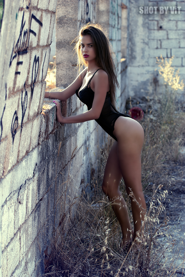
I think the lighting on the upper body is superb. The model is gorgeous. The setting provides an interesting contrast to the girl.
I am assuming that this is meant to be a "pin up" or "erotic" sort of photograph and I'll keep this in mind while writing this, however despite the subject matter I think there are a few universal ways that improvements can be made.
The model's makeup is minimal, or at least looks very simplistic, clean and is a good foil to the messy weeds. But her messy hair, ties together the composition. I think that vague repetition of shapes is working with the grass and hair.
What I'm really liking is that beautiful golden sunshine through the window. It's warm and really emphasising her face and right arm and the curve of her breasts.
I am wondering if a few of the elements to this piece are unnecessary. Would this have looked better if she weren't wearing pink nailpolish? And her bracelet also detracts from the simplistic, but wild 'look' you're going for.
I actually really like the graffiti. I was talking about repetition before and I'll say again how the black graffiti pulls you toward the black corset. (the wall a tad intrusive, but not the graffiti). It's just the lower half of the photograph is weak.
I can't get over the fact that you've taken the airbrushing of her legs too far. And the wheat and her skin look oddly blotchy because of the blurring. That really weakens the natural look of the piece. Granted airbrushing is good, but how this has been done on her legs is too noticeable, and it really shouldn't be there.
I keep feeling that this can be improved by clever cropping, or if it was taken at an angle which the wall wasn't so intrusive. And maybe the model doesn't need that much airbrushing.
Overall there are some very strong points to this photo which could possibly be improved by just shifting a few things. I'd suggest looking at the model as if she wasn't a human, but rather using her to compose the rest of the photo. That is using her lines and her colours.
Still, quite a good job!
I am not entirely sure how deviantart wants me to use stars.